Zoe TL Kirkpatrick
Mobile Redesign for B2B Email Engagement
- Optimized open rates (+40.2%)
- Zeroed out unsubscribe rates (-10.7%)
- Client engagement up, frustration down
Designed for:
Overview
KWCLM, a US top-200 real estate brokerage, creates top performing real estate agents through their nationally recognized sales enablement program, outperforming the average NAR Realtor by 12% in 2022.
Role
Project Lead
UX Design
UI Design
Platform
Mailchimp
Team
Content Supervision: Timothy Lindsey
Timeline
2022 Q1
Problem
Sales Enablement participation is a lead indicator of between 50-400% higher revenue per agent. Program awareness is crucial to the brokerage’s growth.
Enablement training schedules were promoted in a daily email, but unsubscribes were up and opens were down. Low engagement threatened revenue performance.
Solution
A mobile-first email redesign to improve engagement via mobile experience, legibility, and speed of information discovery.
Data Insights
The email isn’t working for agents…
- “I never have any idea what’s happening when.“
- “I only learn about things after they happen.”
- “Oh I never read that email. It’s way too long.“
…but they prefer it over anything else.
Annual satisfaction survey responses indicated a 5:1 preference for the daily email as Agents’ preferred method of receiving information about upcoming trainings and events.
What’s really going on?
Mailchimp data shows agents are opening mostly on mobile, or not at all.
- 70% of agents who opened the email viewed it on their mobile device
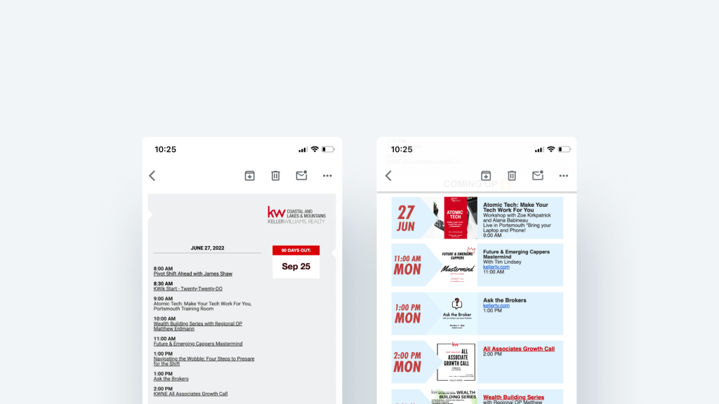
- Desktop-only design wasn’t responsive and lacked a mobile-friendly design.
- Generic subject line repeated daily didn’t grab attention
- Lack of clear information hierarchy caused confusion and information overload
- Important training details hidden on illegible, off-brand class flyers
The Redesign
The redesign focused on priority design activities:
- Subject Lines: Ran A/B tests resulting in top performer: 📣 The Knews, where the emoji changed daily
- Information Hierarchy: Prioritized “need-to-know” info (today’s training) at the top
- Mobile-Friendly Design: Optimized layout and flyer presentation for mobile viewing
- Content cohesion: Branded content frames to clarify detailed information and unite visuals
- Legibility: incorporated training details directly into the email body for improved readability
Visual Identity
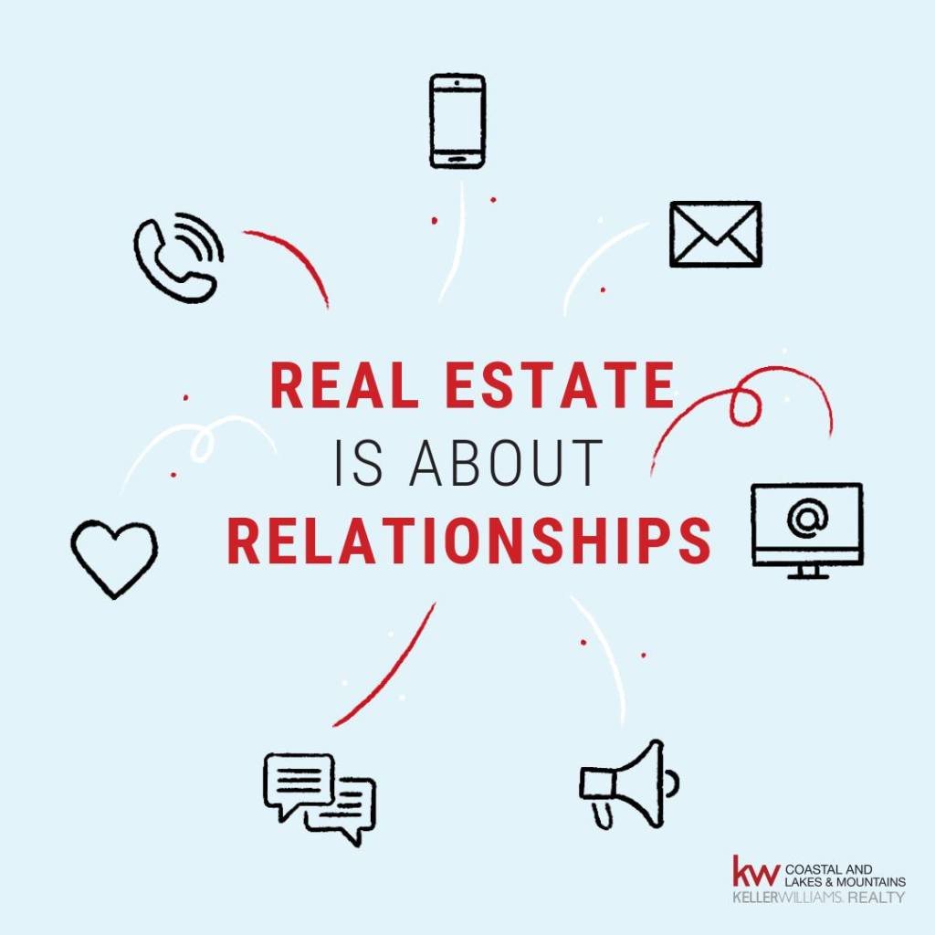
I drew visual inspiration from KW’s training visuals, using brand and accent colors to create a cohesive visual environment.

““It’s so easy to find now, because all I do is look for the email with the emoji. I can always find it!“” – KWCLM Agent
The Impact
- Unsubscribes dropped from 10.7% to 0%
- Email opens increased to 45.2%
- Training awareness significantly improved
Key Takeaways
Design for Mobile First, even for B2B
Busy professionals primarily access emails on mobile devices.
Prioritize Useful Information
Clearly highlight what’s most relevant to users with a clear information hierarchy.
Maintain Consistency
Standardize content using branding for better visual recognition.
